Tazo Packaging
In 2006, I was the sole writer on the rebranding of Tazo. This quirky little tea company had been acquired by Starbucks in 1999, but for years it languished on grocery shelves.
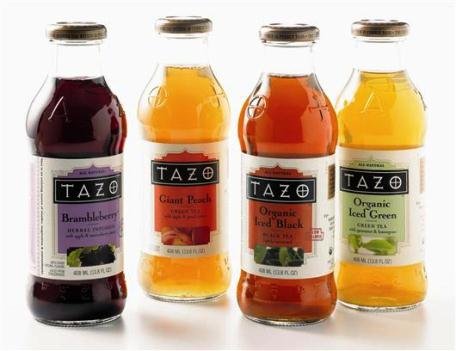
Working closely with a talented design team, we gave the brand new life while keeping its wise, worldly, witty voice. With a brighter look and sharper, more focused messaging, the new packaging created immediate results. One year after launch, Tazo sales were up 32% in the bottled category, 21% in filterbags and 30% in tea latte concentrates.
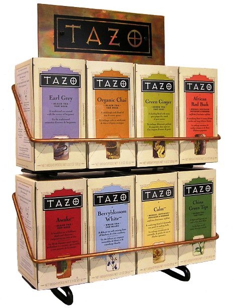
Packaging copy is hard to share in an online portfolio — it’s always better to hold it in your hands. But here are sections from three of my favorite teas:
“Luscious hibiscus flowers join with subtle citrus notes of lemongrass and tart rose hips. Flavors of mango and passion fruit attend the ceremony and bless the union that is now known as TAZO PASSION™. Like love itself, this powerful herbal infusion may make you do crazy things, but it is better to drink it once than never drink it at all.”
“When there is a diem in front of you that absolutely must be carped, reach for a cup of TAZO AWAKE®. This finely balanced blend contains gutty, malty Indian black teas and bright, flavorful teas from Sri Lanka. One sip and you’ll find it to be more flavorful than your typical breakfast tea. It may also help you find your car keys, but no promises.”
“Like a flower petal brushed against the cheek, TAZO BERRYBLOSSOM WHITE is a delicate sensation. But as you sip this blend of shade-dried teas from China and enjoy its subtle nuances, you may be surprised by dazzling notes of blueberries and white cranberries. If this caught you off-guard, try another sip and see if it happens again.”
Role |
Copywriter |
For |
Starbucks |
Date |
2006-07 |
Type |
Brand Work |

Team Credits:
Copywriting: Me
Design: Doug Keyes & Jeff Wilkson (Starbucks)
Creative Direction: Kari Strand (Starbucks)